
Scalable Design as Infrastructure
Seller Card Modularization

The Problem
| "We need another variant!"
Four component variants. Four times the code. Four times the bugs. Four times the maintenance.
Bark's seller card was central to the marketplace experience — displaying professional details, availability, pricing, and interaction points. But as product requirements evolved, so did the component variants. What started as a single card became four hard-coded variants, each with its own codebase, bugs, and maintenance overhead.
The symptoms were clear across all stakeholders:
**Users** experienced visual inconsistencies, unpredictable interactions, perceived platform instability, loss of trust, and increased cognitive load.
**Designers** faced lack of creative flexibility, loss of design authority, iteration velocity collapse, repetitive low-value work, and frustration with not fixing the root issue.
**Developers** dealt with increased technical debt, code duplication, an unmaintainable codebase, code review friction, and limited delivery speeds.
The impact was quantified: 70% code duplication, a 40% bug escape rate, 2-8 hour bug fix times, 18 A/B test paths creating complexity, and a 5x maintenance burden slowing progress.
The Insight: Learnings Transfer
| "I went looking for an Engineer... Meet Alex!"
Applying lessons from Intuit's dark theme challenge to our seller card problem
I had recently seen Intuit solve a similar problem with their dark theme implementation. Their challenge was supporting both light and dark modes for UI components without creating duplicate components:
(e.g., btnLight.jsx, btnDark.jsx)
Their bad approach would have been just to duplicate components.
Their good approach was using a single component with configurable properties:
(e.g., <Button theme='dark'|'light' />)
Their solution was building modularity at its core — no-one can predict the future, so design for flexibility from the start.
This same principle applied perfectly to our seller card problem…
Applied @ Intuit…
Dark Theme – Needed to support both light & dark modes for UI components
Old thinking: Duplicate components (e.g., create Component 537)
New thinking: Use a single component with configurable props
Applied @ Bark…
Hard set, rigid seller card variants, each with its own components
Old thinking: Need a new variant? Create another component
(e.g., create Component 537)New thinking: Need a new configuration? Create a new modular section & trigger

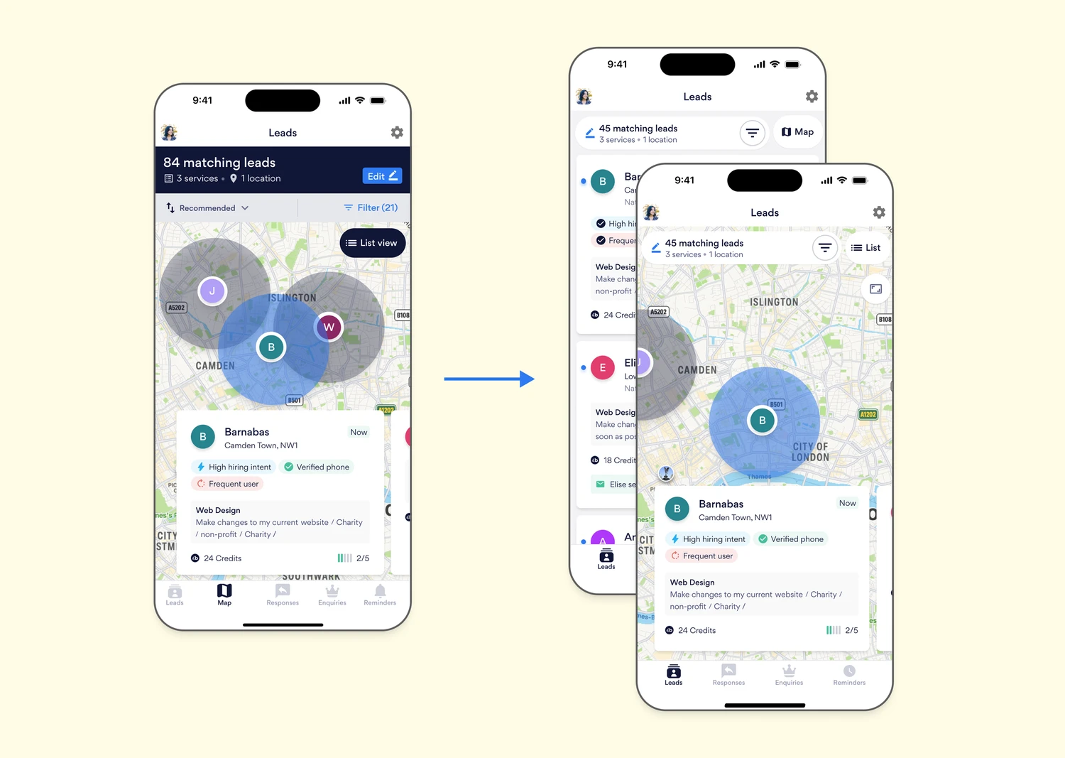
Ten concurrent interviews revealed a consistent misconception: that the leads on the map were different from the ones in the list. Our users saw two different tools instead of two different views of the same dataset.
This was an adoption problem, not a product flaw. So, the obvious opportunity we identified was to integrate the list and map into a unified discovery experience, supported by a single, consistent header and toggling control.
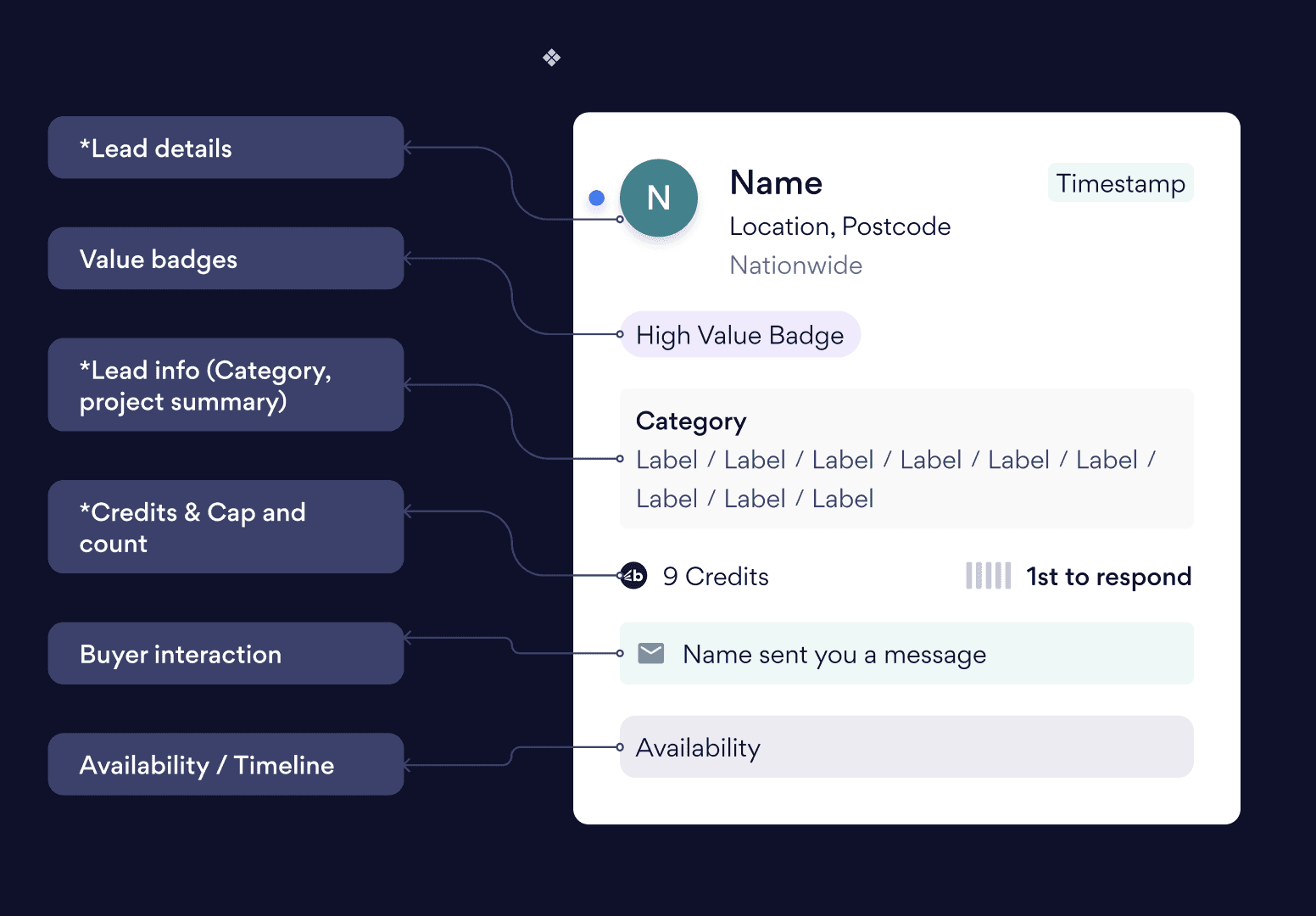
Step 1: Mapping All Possible Sections
| Identifying every potential section block for comprehensive modularity
Map all possible sections | Step 1b: Map all possible sub-sections
We audited and mapped out 4 required sections (Lead Details, Value Badges, Lead Info, and Cost/Cap), and 2 optional sections (Buyer Interaction, and Availability).
Then we identified every potential content module in each top-level section, mapping all possible sub-section combinations. With the 4 required and 2 optional sections and 31 total possible sub-section combos, we arrived at 9,216 possible configurations!
This reinforced the realization: we could not hard-code 9,216 individual variants. The solution was pretty clear: one component, many configurations.

By grounding decisions in impact × reversibility, we reduced risk and increased confidence with stakeholders.
Step 2: Research & Collaboration
| User research, market analysis, and cross-functional brainstorming
User Research
We surveyed users and asked them to rank what information they found most important. This gave us clear priorities for what should be emphasized in the modular design.
Market Analysis
We went out to other platforms to see how they ranked information, and if they had modularized at all. This benchmarking helped validate our approach.
CSD Matrix
I assembled Product Managers, Designers, and Developers for a collaborative brainstorm to identify certainties, suppositions, and doubts about the approach. This cross-functional alignment was crucial for buy-in and successful execution.

The results after two weeks:
+12% increase in lead view-to-purchase conversion
+9% uplift in average session duration
Noticeable drop in user confusion tickets related to “Map vs. List”
The success of this experiment catalysed a new internal standard: Every mobile experiment should clarify a workflow, not complicate it.
As the Head of Product Design, I used this principle to inform Bark’s mobile-first design system — influencing the evolution of elements (headers, tabs, navigational logic, etc…) to support both sellers and buyers with parity.
The Solution
| From multiple cards → single, flexible, modular component structure
We developed a single, standardized, configurable design component for the Seller Card.
This allowed designers to…
Make easier design additions, modifications, or concessions
Standardize visual assets across all sections and sub-sections
Increase design and handoff efficiency
This approach followed our established design principles grounded in user research, market analysis, and collaborative brainstorming sessions with product managers, designers, and developers.
Outcomes: End-User Perspective
| Our design as infrastructure approach directly translated into a consistent, trustworthy experience for every user
Consistent Display
Seller information now appeared consistently across all touch-points: search results, detail pages, and mobile devices.
Reduced Confusion
Users were now noticing design consistency throughout the platform, and this was building better trust.
Faster Decisions
Users were now making more valuable decisions almost twice as fast, and with increased confidence.
Increased Trust
Delivering on consistent design expectations across the platform increased user confidence and value in our platform.
Better Mobile Experience
Unifying the experience across all mediums drastically reduced friction for users when switching between devices, and gave us valuable insights into how our users actually wanted to use our platform.

Within six weeks of launch:
Contact rate improved by 18% vs. web baseline
Buyer satisfaction scores rose by 22 points
The AU pilot became the model for a full UK rollout
Drawing from design leadership principles, I focused on orchestration and ownership — assisting with aligning cross-functional voices around shared outcomes rather than individual deliverables.
Outcomes: Product Designer Perspective
Rapid Prototyping (2 weeks → 2 days)
Accelerated A/B Testing (1 week → 1 day, 7x faster)
Empowered Designers (independent testing)
Leveraged Design System (1 component reused 6x)
Freedom to Iterate
Outcomes: Developer Perspective
Optimized Codebase (27% reduction, 6x reuse)
Drastic Bug Reduction (40% → 2%)
Centralized Fixes (single fix across platform)
Accelerated Feature Velocity (4 days → 4 hours, 8x improvement)
Improved Testing Efficiency (33% fewer test scenarios)
Outcomes: Product & Business Perspective
Strategic Impact (10x experimentation speed)
Improved Time-to-Market (8x faster, weeks→days)
Reduced Technical Debt (20x fewer bugs escaping)
Improved Scalability (pattern applied to 3 other components)
Infrastructure for Future Growth
Key Takeaways
| Learning transfers across contexts
These principles have been crucial to our success and are applicable across various development contexts
Design as Infrastructure
|Great systems solve engineering problems, not just UX challenges.
Constraints Enable Flexibility
Guardrails ensure systems are scalable and maintainable.
Collaboration is Non-Negotiable
Engineering constraints shape robust design solutions.
Measure Everything
Velocity, bugs, and user impact & behavior are all quantifiable metrics.
Learning Transfers Across Contexts
Principles are portable; execution is specific to each scenario. The Intuit dark theme challenge taught us that modularity scales better than duplication — a lesson we applied to transform Bark's seller card system.
Upon Reflection...
This project fundamentally shifted how I think about design leadership. The biggest impact wasn't the component itself—it was proving that treating design as infrastructure creates exponentially more value than treating it as decoration.
By leading with systems thinking, collaborating deeply with engineering, and measuring everything, we didn't just solve a design problem. We created a scalable foundation that continues to accelerate the business today.
The result? A 10x faster experimentation cycle, 8x faster feature delivery, and a 20x reduction in bugs—all while empowering designers, developers, and ultimately, users.
Other Projects...

Outcomes: End-User Perspective
Our design as infrastructure approach directly translated into a consistent, trustworthy experience for every user
Consistent Display
Seller information now appeared consistently across all touch-points: search results, detail pages, and mobile devices.
Reduced Confusion
Users were now noticing design consistency throughout the platform, and this was building better trust.
Faster Decisions
Users were now making more valuable decisions almost twice as fast, and with increased confidence.
Increased Trust
Delivering on consistent design expectations across the platform increased user confidence and value in our platform.
Better Mobile Experience
Unifying the experience across all mediums drastically reduced friction for users when switching between devices, and gave us valuable insights into how our users actually wanted to use our platform.
Within six weeks of launch:
Contact rate improved by 18% vs. web baseline
Buyer satisfaction scores rose by 22 points
The AU pilot became the model for a full UK rollout
Drawing from design leadership principles, I focused on orchestration and ownership — assisting with aligning cross-functional voices around shared outcomes rather than individual deliverables.