Mobile Realignment:
Pivoting to a Mobile-first strategy

Context & Challenge
| “If we invest in a buyer-first experience, we can strengthen the marketplace flywheel.”
By early 2024, Bark’s marketplace growth had plateaued.
Conversion data revealed a healthy supply-side engagement, but a buyer-side liquidity gap: professionals were buying fewer, less relevant leads due to low buyer activation.
As the design lead, I partnered with the Head of Product and CPO to define the product vision for our mobile-first pivot:
Reinvest in buyer trust and participation
Rebuild core mobile navigation patterns to increase task completion and cross-screen retention
Validate design hypotheses with live market feedback
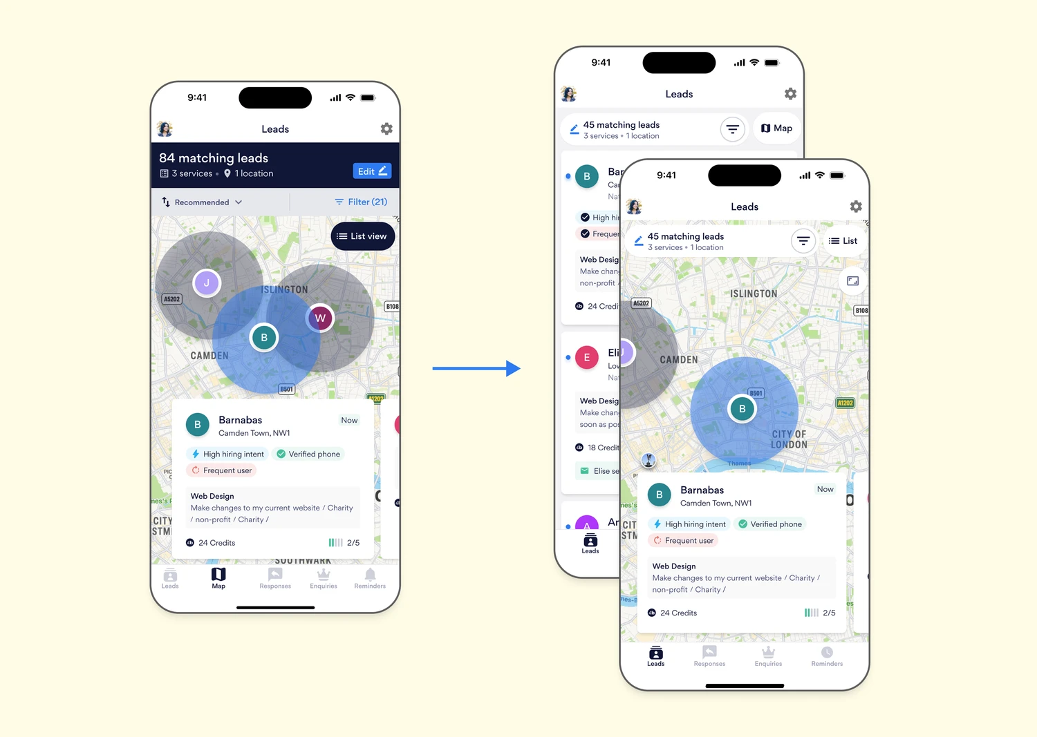
The Map View Gap
| “I thought the leads on the map were differ from the ones in the list.”
Our first opportunity surfaced in the professional (seller) app.
Heap analytics showed that users interacting with the **Map Tab** were more likely to purchase leads — but **33% of those map viewers never converted**.
We launched several in-app surveys to understand why. Within 24 hours, we had over 400 responses and a rich segmentation between “Map users” and “Non-map users.”

Ten concurrent interviews revealed a consistent misconception: that the leads on the map were different from the ones in the list. Our users saw two different tools instead of two different views of the same dataset.
This was an adoption problem, not a product flaw. So, the obvious opportunity we identified was to integrate the list and map into a unified discovery experience, supported by a single, consistent header and toggling control.
Unifying Views, Simplifying Mental Models
| “One place to shop, two ways to view.”
We proposed a merged-tab approach, creating a single index page with a List ↔ Map toggle.
This pattern was validated through competitive benchmarking (Airbnb, Zillow, Rightmove), and user-testing.
We used this opportunity to make sure that we were tying design decisions to our established Design Principles…
Clarity over novelty — merge redundant patterns to reduce cognitive load
Familiarity breeds trust — align with standard marketplace interactions
Progressive reveal — allow deeper exploration without forcing mode switches
Iterations and Trade-Offs
| “impact × reversibility; coaching designers on which, when”
Over five iterations, We partnered with product and engineering to explore design trade-offs — balancing UI space, toggle placement, and map performance.
We weighed through three dimensions…

By grounding decisions in impact × reversibility, we reduced risk and increased confidence with stakeholders.
From Hypothesis to Launch
| “Every mobile experiment should clarify a flow, not complicate it.”
We validated early hypotheses with staged A/B tests:
Control: Dual-tab layout
Variant 1: Two bottom-nav tabs
Variant 2: Unified tab with toggle

The results after two weeks:
+12% increase in lead view-to-purchase conversion
+9% uplift in average session duration
Noticeable drop in user confusion tickets related to “Map vs. List”
The success of this experiment catalysed a new internal standard: Every mobile experiment should clarify a workflow, not complicate it. As the Head of Product Design, I used this principle to inform Bark’s mobile-first design system — influencing the evolution of elements (headers, tabs, navigational logic, etc…) to support both sellers and buyers with parity.
Extending the Pivot: Launching the Buyer App
With learnings from the Map redesign, we were positioned to design Bark’s first dedicated Buyer App — a greenfield initiative targeting buyer engagement in Australia.
Our metric was clear: Contact Rate (the % of buyers contacting a professional per session).
We applied lessons from the seller-side research:
Use location context as a trust cue
Align call-to-action patterns with moment of intent
Pilot in a test market to learn before global scale

Within six weeks of launch:
Contact rate improved by 18% vs. web baseline
Buyer satisfaction scores rose by 22 points
The AU pilot became the model for a full UK rollout
Drawing from design leadership principles, I focused on orchestration and ownership — assisting with aligning cross-functional voices around shared outcomes rather than individual deliverables.
Reflection and Evolution
| “Influence is worth travelling the sometimes difficult road”
Looking back, the “mobile-first pivot” was more than a UX milestone — it was a cultural one.
From designing screens → to designing systems
From delivering assets → to enabling organisational change
From local wins → to marketplace momentum
This project taught me that mobile transformation isn’t about pixels or patterns — it’s about creating coherence at scale.
Our product teams now share a single north star:
> “Empower users on both sides of the marketplace to connect — anywhere, anytime, with confidence.”
| “Empower users on both sides of the marketplace to connect —
anywhere, anytime, with confidence.”
Other Projects...